
Mobile Optimization for Local Businesses
Mobile devices have transformed the way consumers search for and connect with local businesses. With over 84% of people using their smartphones to find services nearby, mobile optimization for local businesses isn’t just a trend—it’s a necessity.
If your website isn’t mobile-friendly, you could be missing out on valuable leads. A slow-loading site or a layout that doesn’t work well on phones can frustrate users and drive them straight to your competitors. Now more than ever, ensuring your site performs well on mobile devices is essential to attracting and converting local customers.
Mobile Search Drives Customer Action
Did you know that 61% of mobile users are more likely to contact a local business if they have a mobile-friendly website? That means your digital first impression can either win or lose a lead in seconds.
When someone searches for your services on the go, they expect a fast, responsive experience. If your website requires pinching to zoom, has hard-to-click buttons, or isn’t loading quickly, chances are they won’t stick around long enough to learn what you offer.
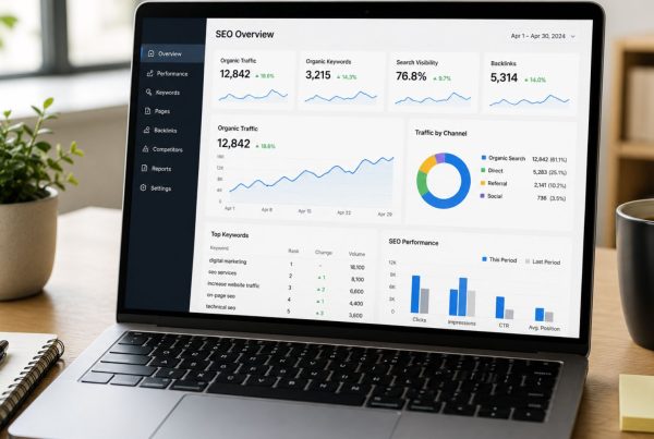
Boost Your Local SEO Rankings
Google rewards websites that are mobile-optimized, especially for searches performed on mobile devices. That means a responsive website can improve your ranking in search engine results, helping more people find your business when they need it most.
A mobile-friendly website also increases your visibility on Google Maps and local search listings, making it easier for users to click, call, or get directions. Local businesses that want to grow can’t afford to ignore how heavily mobile optimization impacts local SEO.

Deliver a Better User Experience
Beyond search engines, a mobile-optimized website delivers a seamless and satisfying user experience. Navigation is easy, content is clear, and customers can take action quickly—whether that’s booking a service, calling your number, or submitting a form.
Plus, today’s customers expect websites to work flawlessly on every device. If your site looks outdated or functions poorly on mobile, it reflects poorly on your brand.
Increased Conversions and Lower Bounce Rates
Mobile optimization doesn’t just help you rank higher—it helps you convert more leads. A responsive website can significantly reduce bounce rates by keeping users engaged. When potential customers can easily navigate your site and take action, you’re more likely to turn visits into calls, form submissions, and sales.
In contrast, a poor mobile experience frustrates users and sends them elsewhere. If you’re spending money on digital marketing or PPC ads, but your site isn’t mobile-friendly, you’re likely wasting part of that investment.
How to Tell If Your Website Needs a Mobile Upgrade
Here are a few signs that your site may not be mobile-optimized:
- Users have to zoom in to read content
- Buttons or links are too small or too close together
- Pages load slowly on mobile devices
- The layout breaks or looks misaligned on phones or tablets
- You’ve had the same design for more than 5 years
You can also run a quick check using Google’s Mobile-Friendly Test to get a performance score and suggestions for improvement.
The ROI of Mobile Optimization
The cost to make your website mobile-friendly is far outweighed by the benefits it delivers.
When you invest in a responsive design, you’re setting the foundation for better SEO, stronger user engagement, and more qualified leads.
It also supports your other marketing efforts like:
- Pay-per-click (PPC) ads: Mobile-optimized landing pages get better Quality Scores, reducing your cost-per-click.
- Social media: Most users browse social media on phones, so it’s important that the links you share lead to a smooth mobile experience.
- Online reviews: Customers are more likely to leave and read reviews from mobile devices—so your site should make it easy to interact.

How to Optimize Your Site for Mobile
Use a Responsive Web Design
Responsive design means your site adjusts automatically based on the screen size. This ensures that whether someone is browsing on a phone, tablet, or desktop, the experience remains seamless.
Compress and Optimize Images
Large images slow down your page load time. Use tools like TinyPNG or ShortPixel to compress images without sacrificing quality.
Prioritize Page Speed
Use Google PageSpeed Insights to identify performance issues. Things like browser caching, minifying code, and reducing server response time can make a big difference.
Simplify Your Navigation
Reduce the number of clicks needed to find key information. Consider adding sticky menus, collapsible sections, or a mobile-specific menu layout.
Optimize Forms and Buttons
Ensure forms are short, easy to complete, and include mobile-friendly features like autofill. Also, make sure buttons are large enough to tap without frustration.
Don’t Let an Outdated Website Cost You Leads
Imagine a potential customer finds your business on Google, clicks through to your site—only to land on a cluttered, slow-loading page that’s not mobile-friendly. In seconds, they’re gone—and likely on to a competitor.
As mobile usage continues to rise—and with it, consumer expectations—businesses must keep pace. If your website doesn’t deliver a great mobile experience, you’re losing visibility, trust, and sales opportunities.
A mobile-optimized website is no longer a luxury—it’s a business essential. From improving local visibility to increasing conversions, mobile optimization for local businesses is a smart, measurable investment.
Whether you’re running digital ads, building your social media presence, or aiming to dominate local search, your mobile website performance can make or break your success.
Need help making your website mobile-friendly? OrangeSky Websites specializes in responsive design and local SEO strategies that help small businesses thrive in today’s digital world. Contact us today to schedule a free consultation.