
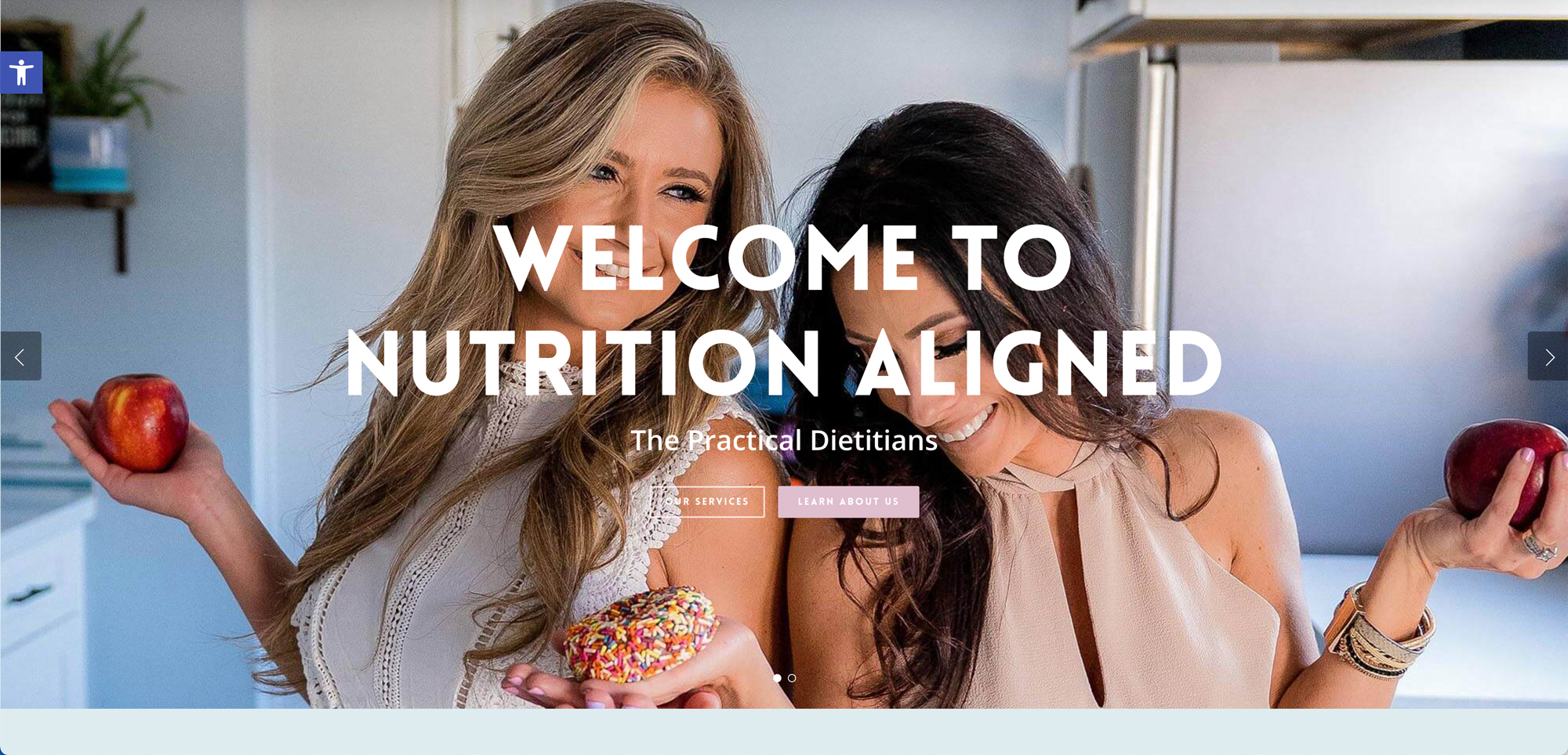
Giving a dietitian practice a welcoming online home
- Client: Nutrition Aligned
- What we did: Website Design
Visit Nutrition Aligned’s website
Nutrition Aligned calls itself “The Practical Dietitians,” and that phrase shaped the whole website. The practice wants people to feel that nutrition help is realistic and not a diet plan with a deadline. So the site had to feel warm, straightforward and easy to act on. Here is how it came together.
A welcome that sets the tone
The home page opens with “Welcome to Nutrition Aligned” and two buttons, Our Services and Learn About Us. Right below, a section called “Personalized Transformation” states the approach in plain words: real science, never fad diets, with one-on-one counseling aimed at realistic changes. The language on the page is the practice’s own, and our job was to give it room to be read.
Three services, three clear blocks
Rather than a long menu, the site presents three numbered services so a visitor can quickly compare them:
- One-on-one consultations for a personalized plan.
- Group education events that friends, families, workout partners or coworkers can host, usually starting with a presentation and followed by short individual goal-setting chats.
- Grocery shopping with a dietitian, a guided store trip aimed at changing everyday habits.
The group and grocery options are less common than a standard appointment, so describing them clearly matters. Visitors may not know they exist unless the page tells them.
Payment information up front
Many people wonder about insurance before they book anything. The home page lists the insurance companies the practice is currently in-network with and notes that other payment options exist, including HSA and FSA cards and a receipt for possible reimbursement. Putting this on the home page saves visitors a phone call and lets them decide whether to continue. We do not make health claims in this design; the practice speaks to its own clients about their care.
Building trust and keeping in touch
The page includes a testimonials section and a newsletter signup. Testimonials help a new visitor see what past clients said in their own words, and the newsletter gives people who are not ready to book a low-pressure way to stay connected. The page ends with a friendly invitation to get in touch.
Design choices
We kept the layout open and the sections short. There are only a few headings, each answering one question: what do you do, how do I pay, what do others say, and how do I reach you.
Related projects
Another practice-based site in our portfolio is House Call Chiros. For details on how we plan structure and content, see website design, and learn how website speed optimization keeps pages quick on phones.
Start your project
If you want a site that is organized this clearly for your own visitors, contact OrangeSky Websites and tell us about your business.