
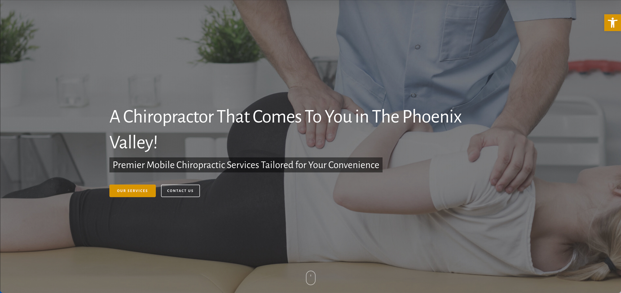
Designing a website for a chiropractor that comes to you
- Client: House Call Chiros
- What we did: Website Design
Visit House Call Chiros’s website
Most chiropractic websites show an office and a map. House Call Chiros has neither, because the whole service is mobile. That changes what the website has to explain. A new visitor first needs to understand how the idea works, and only then will they look at details. This case study covers how the site handles that.
The idea comes first
The home page opens with a slider of three headline messages: mobile shockwave therapy, a personal injury focus, and a chiropractor who comes to you in the Phoenix Valley. Each has buttons leading to services or contact. Below that, a section titled “We Are A 100% Mobile Service” lists the places the visits can happen, including homes, workplaces and on-site locations. The point of the page is to answer the obvious first question, “wait, they come to me?”
Page structure
- An introduction to the practice and how the mobile model works.
- A section on the benefits of mobile care, written for people with busy schedules or a preference for privacy.
- A closing message repeating the core idea and inviting contact.
- A frequently asked questions section so common questions are answered on the page.
- A service area section showing where the team travels.
Why the FAQ and service area matter
A mobile service raises practical questions an office never gets: where do you travel, what do you need from me, how does a visit go? Putting a questions section and a service area section on the home page keeps people from having to guess or call just to check coverage. We have not made any health claims in this design. The site presents the service and lets visitors reach out to the practice itself with clinical questions.
Several audiences, one message
The copy speaks to entrepreneurs, busy professionals, parents and anyone who wants a more personal approach. Instead of separate pages for each, we kept a single page with the audiences named in the text so every visitor sees themselves in it.
Meeting the team
The site includes a Meet the Team link and a clear Services button near the top. People deciding on a health provider want to know who is coming to their door, so the team page sits close to the front and not buried in the menu.
Related projects
Another health-related build in our portfolio is Nutrition Aligned. If your business also has a mobile or service-area model, our AI search ready websites approach is designed so that location and service details are easy for search tools to read. For the broader process, see website design.
Start your project
If you want a site that is organized this clearly for your own visitors, contact OrangeSky Websites and tell us about your business.