
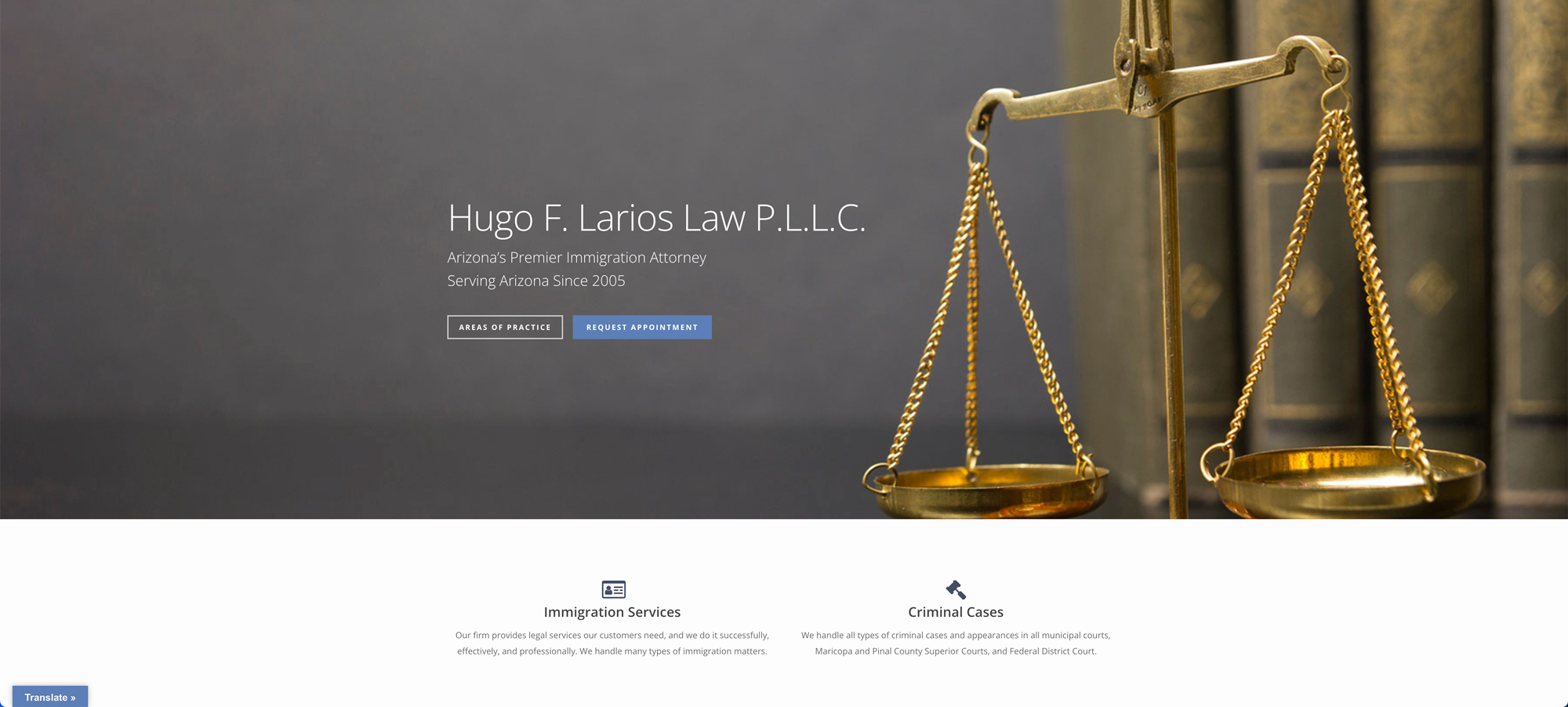
A law firm website built for clarity first
- Client: Hugo Larios Law Firm
- What we did: Website Design
Visit Hugo Larios Law Firm’s website
People visit a law firm’s website at a stressful time. They want to know quickly whether the firm handles their kind of matter and how to reach someone. For this Arizona practice, we focused on structure: make the practice areas obvious, keep the pages short, and place the next step where the visitor is already looking. We make no legal claims in this write-up; it covers how the site is organized.
The first screen
The home page opens with the firm’s name, a line identifying it as an Arizona immigration practice serving the state since 2005, and two buttons: Areas of Practice and Request Appointment. Those two choices cover the two things most first-time visitors want, which is to see what the firm handles and to make contact.
Two practice areas, clearly separated
The firm works on two kinds of matters, and the page gives each its own labeled block.
- Immigration services: a short description of the types of immigration matters the firm takes on.
- Criminal cases: a description of the courts where the firm appears, including municipal courts, county superior courts and federal district court.
Keeping these apart avoids confusion. Someone with an immigration question does not have to read through criminal court details, and vice versa. A phone number and an invitation to schedule an appointment appear right after both blocks.
A short page on purpose
The home page is intentionally brief. After the practice areas there is a section explaining that the immigration and visa process can feel complicated, followed by a few reviews left by past clients and displayed with their names as written. The page ends with one more appointment button and a simple footer menu: Home, Personnel, Areas of Practice and Contact.
Navigation that stays simple
Four menu items is enough. Law firm sites often grow into dozens of pages that nobody reads. By keeping a small menu, every page is reachable in one click and the contact option is never far away. This also helps on phones, where long menus are hard to use.
Making it findable
The page title names the practice type and the state, which tells both visitors and search engines what the page is about. Read more about how we handle this in our search engine optimization work.
Related projects
For another service business where trust and clarity matter, see Ascender Credit Repair. You can also browse our wider website design work.
Start your project
If you want a site that is organized this clearly for your own visitors, contact OrangeSky Websites and tell us about your business.