
Mobile-Friendly Website for Local SEO: Why Mobile Optimization Matters More Than Ever
Most people searching for a local business today aren’t doing it from a desktop computer—they’re doing it from their phones.
Whether someone is looking for a nearby restaurant, a roofing company, or a local service provider, chances are they’re searching while on the go. They want quick answers, fast-loading pages, and an easy way to contact a business immediately.
That’s why having a mobile-friendly website for local SEO is no longer optional. It’s one of the most important factors in how customers find, experience, and interact with your business online.
If your website is difficult to use on a smartphone, loads slowly, or forces users to zoom and scroll excessively, potential customers are far more likely to leave and contact a competitor instead.
Mobile Searches Are Driving Local Business Growth
Mobile usage has completely changed how people search online.
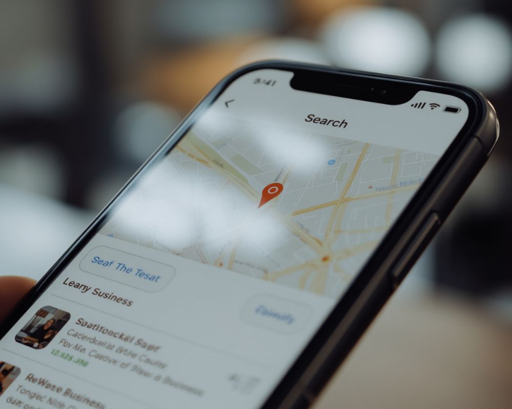
Today, consumers rely heavily on smartphones to research businesses, compare services, and make buying decisions in real time. From checking reviews to viewing directions in Google Maps, mobile devices are now a major part of the customer journey.
In fact, studies consistently show that mobile users are more likely to contact businesses with websites that are easy to use on smaller screens.
This means your mobile experience directly affects whether a visitor becomes a lead—or leaves your site entirely.
Why Mobile Optimization Matters for Local SEO
Search engines like Google Search prioritize mobile-friendly websites because they want to deliver the best experience to users.
If your website performs poorly on mobile devices, it can negatively impact:
- Search rankings
- User engagement
- Time spent on site
- Conversion rates
A mobile-optimized website helps search engines understand that your business provides a positive user experience, which can improve visibility in both local search results and map listings.
In simple terms, better mobile usability supports stronger local SEO performance.
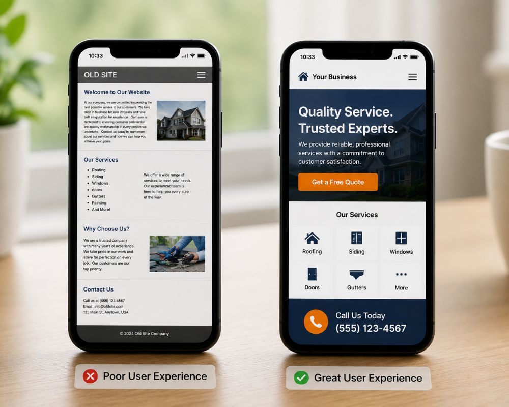
First Impressions Happen Fast on Mobile
Mobile users tend to make decisions quickly.
When someone lands on your site from a smartphone, they immediately judge whether your business feels trustworthy, modern, and easy to work with. If the page is cluttered, difficult to navigate, or slow to load, they often leave within seconds.
On the other hand, a clean and responsive website creates confidence right away.
Visitors should be able to:
- Read content easily
- Navigate without frustration
- Find contact information quickly
- Tap buttons comfortably
- Load pages without delays
These small usability details have a major impact on lead generation and customer trust.
Responsive Design Makes a Big Difference
One of the best ways to improve mobile usability is through responsive web design.
A responsive website automatically adjusts to fit different screen sizes, whether someone is visiting from a smartphone, tablet, or desktop computer.
Instead of creating separate mobile and desktop versions of your site, responsive design creates a consistent experience across all devices.
This improves:
- User experience
- SEO performance
- Site management
- Conversion rates
It also helps future-proof your website as devices and screen sizes continue to evolve.
Mobile Optimization Helps Convert More Leads
Generating traffic is important, but converting visitors into leads is what ultimately drives business growth.
A mobile-friendly site removes barriers that prevent users from taking action. If someone can quickly find your phone number, submit a form, or request a quote from their phone, they are far more likely to contact you.
This becomes even more important for local businesses, where customers often need immediate solutions.
For example, someone searching for a plumber, roofer, or HVAC company from their smartphone is usually looking to act quickly—not spend time struggling with a poorly designed website.
Poor Mobile Experiences Cost Businesses Money
Many businesses underestimate how much revenue they lose because of poor mobile usability.
A site that is difficult to navigate on mobile devices can increase bounce rates and reduce trust. Even if your SEO or paid advertising campaigns are generating traffic, poor mobile performance can prevent that traffic from converting.
This means your marketing budget becomes less effective.
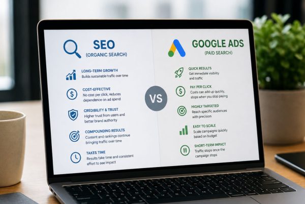
Whether you’re investing in local SEO or running ads through platforms like Google Ads, mobile optimization plays a major role in overall ROI.
A strong mobile experience helps ensure your marketing efforts lead to actual conversions—not abandoned visits.
Mobile Optimization Supports PPC Advertising
Paid advertising campaigns often generate a large percentage of mobile traffic.
If users click on an ad and land on a website that loads poorly or feels difficult to use, they are likely to leave before taking action. This increases ad costs and lowers campaign performance.
A responsive website improves the effectiveness of PPC campaigns by creating a smoother experience after the click.
When paired with strong advertising strategies, mobile optimization helps businesses maximize every visitor and every lead opportunity.
Signs Your Website May Not Be Mobile-Friendly
Sometimes businesses don’t realize their website has mobile usability issues until customers stop engaging.
Common warning signs include:
- Text that appears too small on phones
- Buttons that are difficult to tap
- Slow loading speeds
- Menus that don’t function properly
- Horizontal scrolling on mobile devices
Even small frustrations can push visitors away.
Testing your site regularly on different devices is one of the simplest ways to identify these issues before they impact your leads.
Why Mobile Optimization Is a Long-Term Investment
Improving your mobile experience isn’t just about fixing problems today—it’s about preparing your business for how customers will continue searching in the future.
Mobile traffic continues to grow every year, and user expectations are higher than ever. Businesses that prioritize responsive design and mobile usability position themselves for stronger long-term growth online.
The investment required to optimize a website for mobile devices is relatively small compared to the potential impact on rankings, conversions, and customer trust.
Final Thoughts: A Better Mobile Experience Leads to Better Results
Your website may look great on desktop—but if it doesn’t perform well on mobile devices, you could be losing valuable leads every day.
A strong mobile-friendly website for local SEO improves search visibility, creates a better user experience, and helps convert more visitors into customers. It also supports your broader marketing efforts, from SEO to PPC advertising and local search visibility.
At OrangeSky Websites, we help businesses create responsive, mobile-optimized websites designed to improve rankings, increase conversions, and provide a seamless experience across every device.
If your website isn’t fully optimized for mobile users, now is the perfect time to improve it and strengthen your online presence for the future. Contact OrangeSky Websites today to get started.