
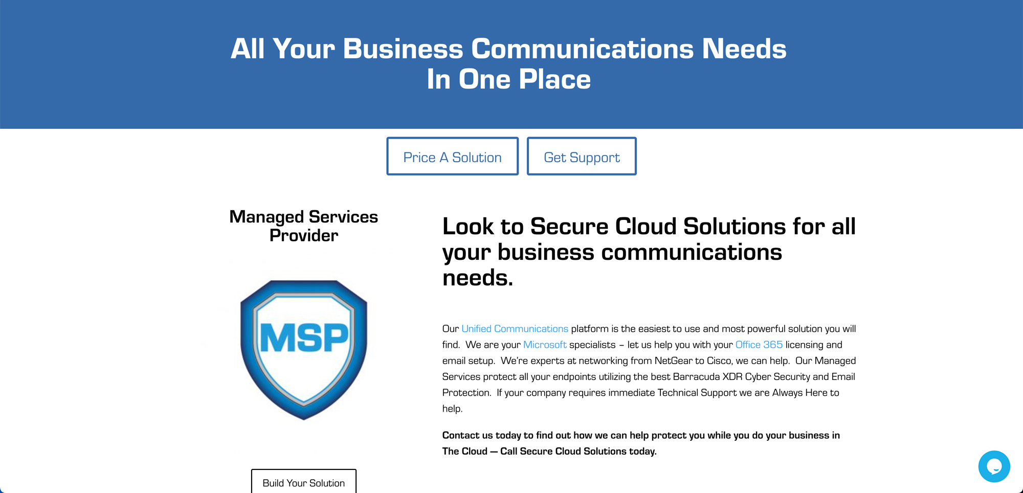
Making business phone systems easy to understand: Secure Cloud Solutions
- Client: Secure Cloud Solutions
- What we did: Website Design
Visit Secure Cloud Solutions’s website
Secure Cloud Solutions supports small and medium-sized businesses with phone systems and related technology. The challenge with a company like this is that the subject can be dry and the offering wide. The website had to make a technical service feel approachable.
One page, four clear paths
The homepage headline says the company covers all of a business’s communications needs in one place. Under it, four blocks split the offer into Unified Communications, Microsoft Business, Networking and Technical Support. Each block has its own button, such as “Price A Solution”, “Get A Quote”, “Click Here” and “Get Help”, so a visitor picks the path that fits their problem.
This matters because the people arriving have different needs. One is shopping for a new phone system. Another has a network that keeps dropping. A third needs help right now. The layout lets each of them act without reading everything else first.
Organizing a deep product section
The phone system alone has a lot to explain, and the menu reflects that. Sub-pages cover the voice service, admin tools, the mobile app, CRM and Google integration, voicemail transcribed into email, fax, and Microsoft Teams integration. There are also separate training video pages for company administrators and for everyday users.
- Feature pages grouped under the main phone system menu
- Training video pages split by audience, admin or basic user
- A page for other voice options for customers with different needs
- Quote-request and support buttons on the homepage
Grouping features this way keeps the top level tidy while still giving each topic its own address that people can find through search.
Explaining why to choose them
A “Why Secure Cloud Solutions?” section answers the question in three parts: security, productivity and the bottom line. Each gets a short paragraph in plain language. The homepage also points out that the company has been in business since 2009, which is useful context for a buyer who is deciding whom to trust with their phones.
Our design approach
We aimed for a layout where a business owner who is not technical can still tell what each service does in a few seconds. Headings are short, sections are separated clearly, and every section ends with a way to take action. Read more about how we plan this in our website design service.
Helping AI tools and search engines understand it
Technology buyers increasingly ask AI assistants for recommendations. Clear headings and plain descriptions of each service help those tools summarize a company correctly. We cover this on our AI search ready websites page.
Related project
For a different kind of business, see our work for Collaborative Agents.
Have a complicated service to explain?
If your business offers more than one thing and visitors struggle to find the right one, we can help organize it. Contact OrangeSky to talk it through.